The new year is always a robust time for companies and products to consider or plan rebranding. Why? Perhaps fiscal year planning or budgeting? Maybe a new strategic direction? Or possibly a competitive response. No question the foundation of many rebrands is the logo. A great starting point for developing a new logo is to consider logo trends. Another worthwhile exercise is evaluate the most effective, and least effective logo redesigns. To that end, IDeas BIG is pleased to bring you the best and worst logos of 2021.
The 5 of the Best Logos of 2021
KIA
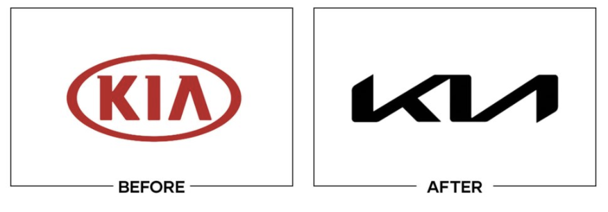
In an industry that has dated logos, KIA decided to design a logo that elevates the brand voice to near elegant. The logo feels more exciting than the old one.
SNAPPLE
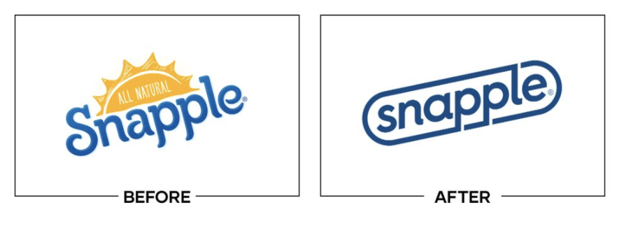
The new logo is clean and simple. This new logo speaks to its new formula that Snapple is using.
Chicago Fire
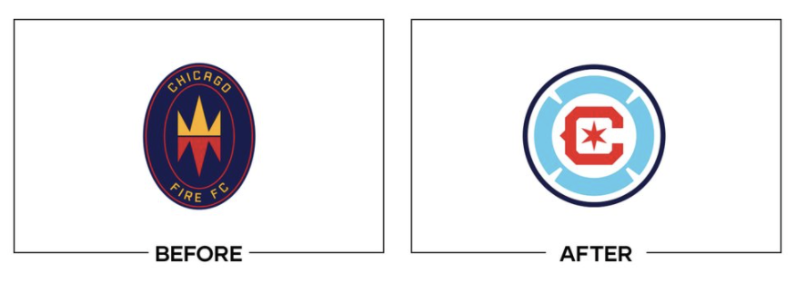
The Fire ditched their old logo for a symbol that represents the city of Chicago with the Chicago blue and red and star.
ABC
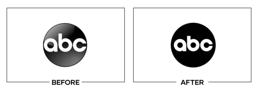
These logos may look the same, but the new logo has new typography and is all black, instead of the faded look. It is easier to read on screens.
Burger King
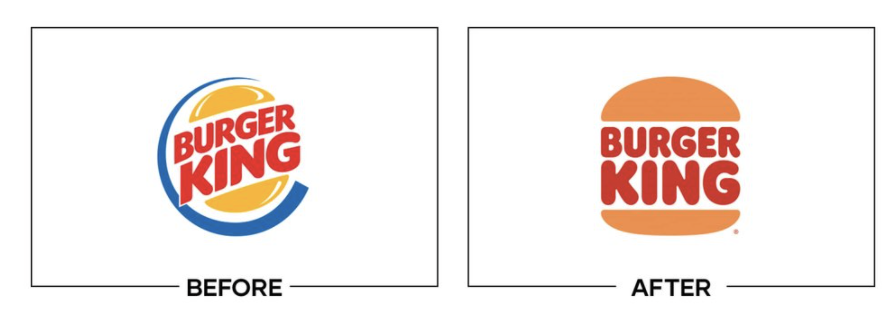
The new logo embraces the old logo but with a little modernization to it.
The 5 of the Worst Logos of 2021
Hot Pockets
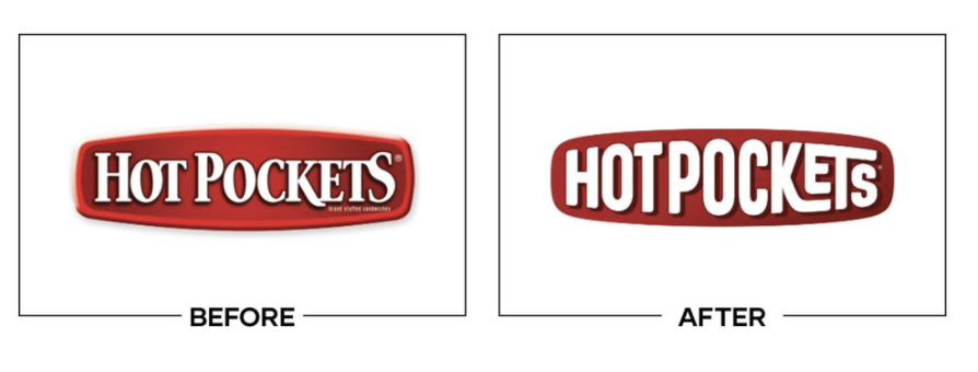
This logo feels like a hot mess. The “KETS” is the main attention, and honestly, is more confusing than anything. Not shaping the logo as a hot pocket seems like a missed opportunity.
Meta
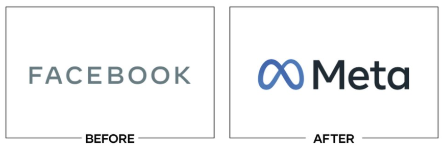
Everybody knows Facebook rebranded to Meta in 2021. How do we feel about the Meta logo? It is considered one of the worst logos of 2021 for not telling us what the product does or is.
Papa John’s
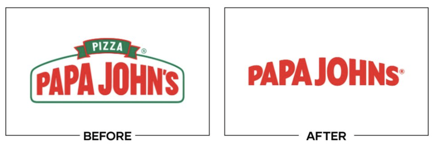
The before logo was not the greatest, but at least it shared what the company does or offers.
Guardians
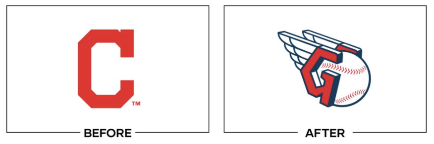
Props to the Guardians for rebranding, but in an industry that needs its logos to frequently scale down and become one-color, this logo fails both of these tests.
Calendly
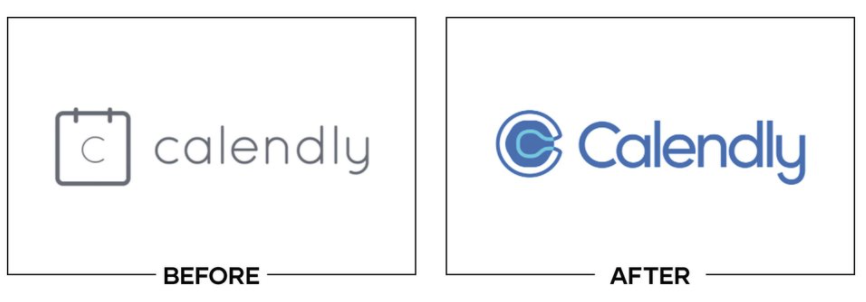
Ditching the calendar-based icon is not the greatest decision. This icon showed what the company offered. The type of “C” is hard to read as well.
Be the Best Logo of 2022 and Not the Worst
Brands need to evolve over time, and that includes logos. Sometimes, brands must reposition based on new offerings, to contemporize, to overcome negativity, or to improve a prior weak brand execution. As you can see effective logo creation can be hit or miss. Good or bad. To improve your chances of being recognized for logo excellence, consider your customer, your brand positioning, and hire a professional branding agency that is skilled in both strategy and creative execution. There are plenty of cheap logo design services. But your brand image is too important to risk when it comes to logos.
Additional Logo Resources
How Color Impacts Logos and Branding
The Evolution of Major Brand Logos
Selecting the “Write” Font for Your Brand Logo [INFORGRAPHIC]

