Not to be outdone by competitors’ rebrands, Southwest Airlines, the airline giant that continues to grow, has announced a rebrand of its own; putting its heart on its sleeve and displaying its commitment to employees.
New Look, Same Great Southwest Experience
(From the Southwest Press Release) Southwest Airlines(R) introduced a modern new look to its iconic brand today at an event dedicated to its Employees. The airline proudly unveiled a new aircraft livery, named Heart, airport experience, and logo. The new look puts the airline’s Heart on display, showcasing the strength of the nearly 46,000 Employees Companywide–whose dedication can be felt by every Customer each time Southwest Airlines connects them to what’s important in their life.
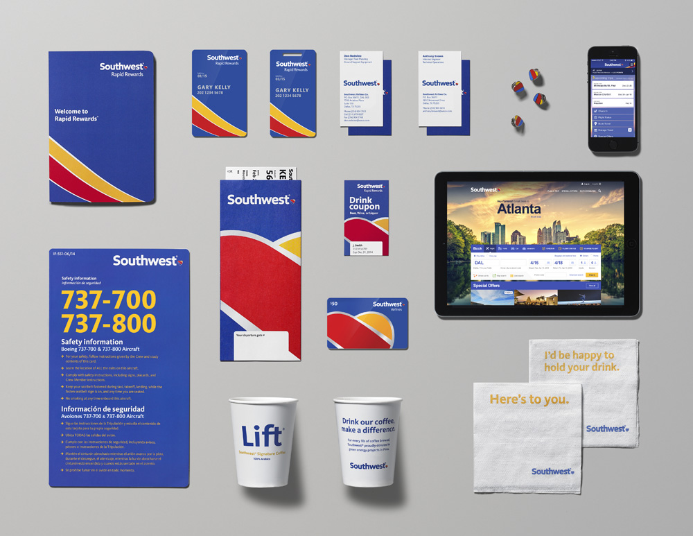
What’s included in the new rebrand? Considered a “New Look, Same Great Experience” movement, Southwest Airlines’ modern new look introduces a striking new livery design, new iconic Southwest logo, newly designed inflight materials and magazine, an advertising campaign that celebrates the airline’s unique personality, and a revamped experience both online and at its airport locations, all of which showcase the unique spirit and Heart of the brand, and communicate its focus on Customer care. In addition, the airline will introduce a refresh to its signature “DING!” mnemonic.
Southwest’s relaunch is by far the airline’s biggest to date. Southwest has tinkered with various branding elements over time, but this push is different in that it covers all communications, products and even its airport kiosks. Southwest revamped its planes exteriors in 2001, but the company continued to use the same logo and marketing. In recent years, it’s cycled through a number of campaigns and taglines, but kept the same look on its aircraft.
New Livery Design
The planes’ new look, dubbed Heart One, prominently displays the company’s name across the fuselage (previously it was on the plane’s tail). As the name suggests, the new look also includes hearts — the brand’s longtime symbol — on the belly of the aircraft, as well as one on either side of the plane near the entrance doors.
New Logo
As a result of research conducted in the form of focus groups with both employees and customers to determine how best to create the new look, the airline says it decided to retain its existing color palette and striped tail that has long identified the carrier.
New In-Flight Experience
From the revamped in-flight magazine to the snack packaging, Southwest has taken this rebrand to heart. Customers will soon begin noticing an entirely new visual experience, all the way down to the packaging of Southwest’s famous complimentary snacks. Southwest’s iconic colors have even evolved, and the airline commissioned a custom typeface. Eventually, everything will be given a voice and a look that reflects the refreshed brand, from the planes themselves to the website, billboards, TV commercials, and more.
New Ad Campaign and Tagline
Last September, the company launched a tagline, “If it matters to you, it matters to us.” One of its more well-known taglines was “You’re now free to move about the country,” which was punctuated with a mnemonic “ding” at the end of each spot. That tagline (ding included) was last used in 2008. The ding itself was last used in 2011.
“Some Say we do things differently. We say, ‘why would we do things any other way?’ Without a heart, it’s just a machine.” This line closes out the ad, narrated by Rashida Jones
A second phase will launch in early October and comprise the long-term messaging, said Helen Limpitlaw, director-brand communications at Southwest. That campaign will focus on its employees’ hospitality. A new tagline will also be unveiled then and used moving forward. Ms. Limpitlaw declined to specify, noting only that it will focus on a “people-first idea.” Work for phase two is still being finalized.
Conclusion
“The job wasn’t to change who we are,” said Kevin Krone, Southwest’s Vice President and Chief Marketing Officer. “We already know who we are. The job was to keep the elements of Southwest that our Employees and Customers love, and to make them a bold, modern expression of our future.”
The Southwest rebrand breathes new life into a growing brand, and with the repeal of the Wright Amendment, the airline will be able to fly nonstop to additional airports.
Want to see more rebrands? We took a look back at big rebrands in 2014.
Looking for a Rebrand of your own? Contact Naperville Branding Agency IDeas BIG today!
Related: The New American
Related: EADS Rebrands to Airbus Group
4 Comments
Pingbacks
-
[…] Showing a Little Heart: An Overview of the Southwest Airlines Rebrand […]
-
[…] Southwest’s rebrand is by far the airline’s biggest to date. Southwest has tinkered with various branding elements over time, but this push is different in that it covers all communications, products and even its airport kiosks. Southwest revamped its planes exteriors in 2001, but the company continued to use the same logo and marketing. In recent years, it’s cycled through a number of campaigns and taglines, but kept the same look on its aircraft. […]
-
[…] is one of the most well-regarded airlines in the U.S. Their new identity, launched in September, 2014, introduced a heart as the company’s main symbol. The old one […]
-
[…] is one of the most well-regarded airlines in the U.S. Their new identity, launched in September 2014, introduced a heart as the company’s main symbol. The old one — […]


