The difference between evolving or rebranding your logo is a matter of degree. Evolving or evolution is minor changes, while rebranding is new or starting over.
Branding experts say a logo should evolve every 7-10 years. Why? To remain relevant, contemporary, interesting, and perhaps even to create some excitement. Let’s consider case studies of each scenario: evolution and rebranding.
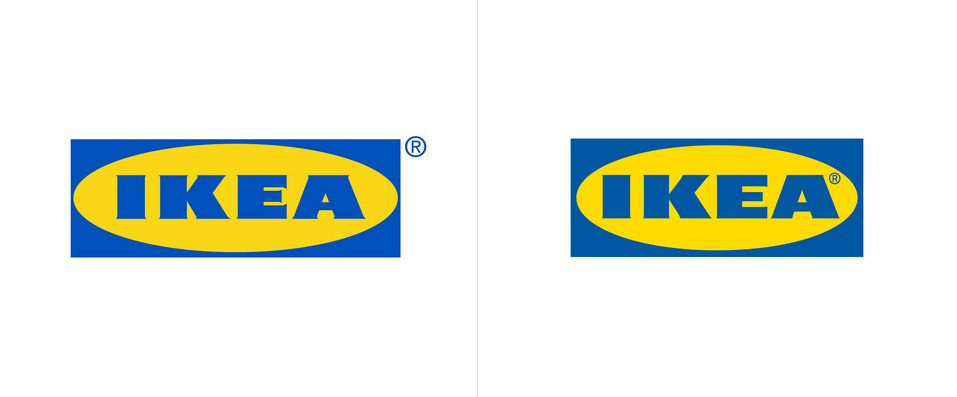
IKEA is a great example of a logo evolution. Seventy Agency from Stockholm, Sweden “transformed (evolved) one of the most famous logos in world. Following are excerpts from the logo project brief:
“-Redraw the logo to increase legibility.
-Ensure optimization of the IKEA logo for both digital and physical use in small and large sizes.
-The new IKEA logo shouldn’t require re-registration of the trademark.
-The new IKEA logo must co-exist and be used in close proximity to the old logo for a period of time.
We wanted to maintain the unique characteristics of the original iconic design, but make subtle, yet impactful changes to the logo for a better experience across all formats.
One of these changes was increasing the optical size of the brand name. By changing the proportions of the box and oval, we increased the letter size by 15%. Creating a bigger brand presence within the same amount of media space.
By refining and redrawing the letters, e.g. reducing the flares, the new IKEA logo is now optimized for both digital formats and small print formats. We also increased the counters in letter E and A for greater legibility.
IMAGE: IKEA Logos – before and after

Image taken from Brand New
The ® was moved from outside the logo to be incorporated into the design, enabling an easier alignment of the logo.
The updated IKEA blue and yellow colors will take on a larger branding role, aiding the experience of IKEA in current and new meeting points. The new colors make it easier to reproduce the logo more consistently. They are now optically enhanced, optimized for individual color experiences, even when they are not sitting next to each other.”
Most consumers have not realized the IKEA logo evolution. It was that subtle but has made a big impact.
Now let’s consider a logo rebrand.
Navy Pier is one of Chicago’s most recognized landmarks. It sits along the lakefront and is part of the iconic Chicago skyline. Navy Pier has nearly 9 million visitors per year that come to dine, dance, attend concerts and shows, and of course, ride in the massive Ferris Wheel that references the World’s Fair of 1893 Navy Pier is truly a national icon.
The Navy Pier logo was previously redesigned in 2008. The logo was a dark navy blue and white, without other colors. The old logo had multiple landmarks, along with the Ferris Wheel in the back. Nothing was spectacular and grabbing the audience.
The new Navy Pier logo was updated to be more vibrant and eye-catching, rather than dull and lackluster. The technological advance rebrand references the use of animation of the logo in key applications like the website.
With the new logo, the colors are vibrant with the Ferris wheel being the main focus. ColorJar is the design firm that created the new Navy Pier logo. The logo’s colors referenced different pieces of the Navy Pier experience including Navy Blue, firework magenta, and lakeshore blue. These are the animated colors that make up the new logo and bring it to life.
IMAGE: Logos Before and After

Image taken from colorjar
IKEA and Navy Pier are just two examples of brands that have evolved or rebranded their logo recently. Both have gone in different paths, IKEA made small subtle changes that are barely noticeable, while Navy Pier changed their logo completely and became more energetic.
Want to see more logo evolutions, and outright rebrands? Take a look at Rebranded Logos of Famous Brands in 2015, to see how other brands have evolved.
Additional Logo Rebrand Resources:


