A logo is one of the most important components of your brand. It must convey meaning, and reinforce a desired image and positioning. But the world changes, and logos should evolve over time. Therefore, it’s instructive to continually benchmark logo trends and best practices. To that end, we bring you the Best and Worst Logos of 2020.
10 Best Logos
Adler Planetarium
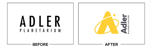
Adler Planetarium visitor base is about the children. With this new logo, it is open and inviting, but also gives the feel of interactive and educational.
Lifetime
This new logo offers legibility and beauty. Lifetime is known for emotional movies; therefore, this new logo brings more emotion to the brand.
Popeyes
Popeyes’ new logo is reusable, and this company is moving in the right direction.
Little League
The old logo was hard to read, so this new logo is easier to read. It is also switching to a more professional logo.
Avon
The bold lettering feels like a fresh take on what this beauty brand can be.
Casey’s
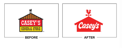
Casey’s is switching to a more modern feel. The new logo is welcoming and recognizable now.
Fischer-Price
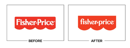
Fischer-Price did not make a huge change to their logo, but it went back to its roots by the orange-red tone, lowercase letting, and sharp edges.
The Athletic
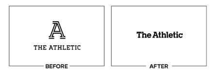
Ditching the “A” has allowed this brand to feel more connect. The new logo is more clean and to the point.
Hello Fresh
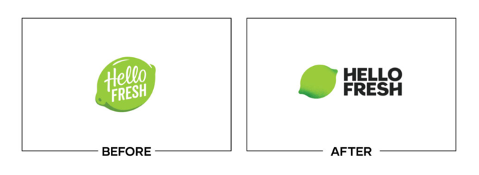
Hello Fresh has gone modern. They converted to one color and a new font.
Afterpay
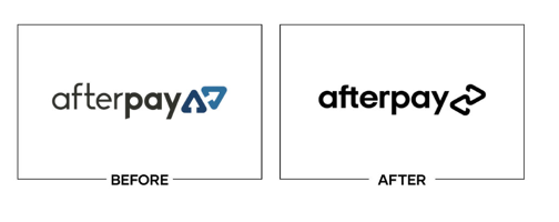
The new logo tells their story of an exchange. It lets us know what they do.
10 Worst Logos of 2020
Smuckers
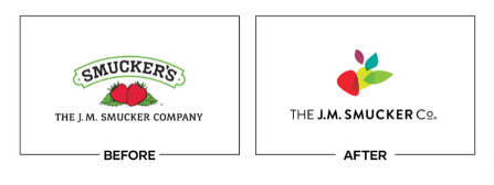
The new logo is too modern for the “mom and pop” feel the company is known for. Also, taking away “Smucker’s” in the logo is not a smart decision, due to that is what made it famous.
Petco
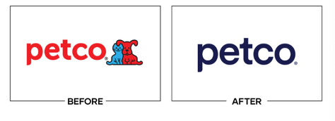
Updating the typography is okay, but removing the pets is losing the brand personality. Changing the logo to dark blue is losing the fun-loving attitude that the logo established.
Dave & Buster’s
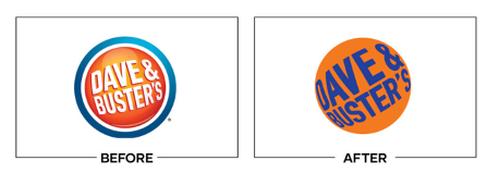
Blue on Orange just does not go.
TVA
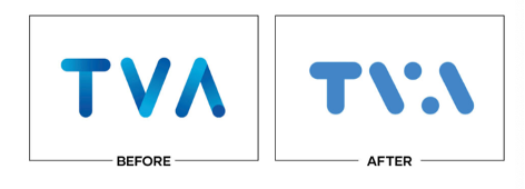
The “V” and “A” can be lost since they no longer connect with a line.
Gmail
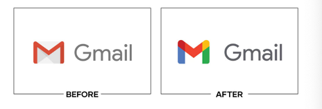
Google aligned its G-suite apps in 2020, but changing the logos have made it hard to differentiate between apps. The new logo lacks a one-color version, as well.
Sailor
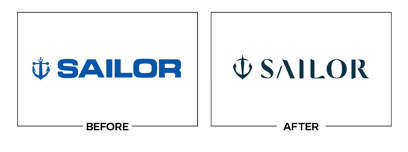
The before logo was easier to read. The new logo makes the “A” disappear at a small scale.
U.S. Cellular
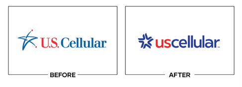
The new logo is an improvement, but it seems young compared to the rest of the market.
Shipt
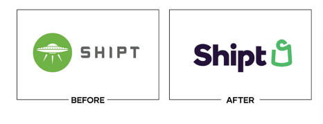
The new logo is not a bad logo, but it is just a disconnect to the brand’s voice. Also, it is hard to tell that shopping bag is a shopping bag.
Sonic
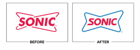
The “S” in this new logo does not flow with the rest of the logo. The new logo also sets a feeling of a classic drive-in, instead of a fun and inviting restaurant.
Skillshare
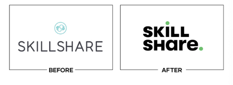
The new logo is trying to blend in with the “cool” kids. Also, mixing capital and lowercase letters needs to stop.
Be the Best Logo of 2021 and Not the Worst
Brands need to evolve over time, and that includes logos. Sometimes, brands have to reposition based on new offerings, to contemporize, to overcome negativity, or to improve a prior weak brand execution. As you can see effective logo creation can be hit or miss. Good or bad. To improve your chances of being recognized for logo excellence, consider your customer, your brand positioning, and hire a professional branding agency that is skilled in both strategy and creative execution. There are plenty of cheap logo design services. But your brand image is too important to risk when it comes to logos.
Additional Rebranding Resources
10 Log0 Trends for 2020 (IDeas BIG)
Rebranding? 5 Questions to Ask Before You Get Started (Inc)
When Should A Company Rebrand? (IDeas BIG)
4 Ways to Know When It’s Time to Rebrand Your Business (Entrepreneur)
Request a Complimentary Brand Assessment from IDeas BIG here.

