As 2014 comes to a close, we thought we would take a look back at some big rebrands that happened this year. Check them out below.
Airbnb Rebranding
Airnb is a popular online service and community that connects people who have some spare space and those who are looking for a place to stay. Users can list their home on the website and rent it out to guests. After years of rapid growth, Airbnb rebranded in July 2014.
The rebrand was guided by their new philosophy, “Belong Anywhere“, and includes updates to the website and a new logo that they call the Bélo. “It’s an iconic mark for our windows, our doors, and our shared values,” says Brian Chesky, founder and CEO of Airbnb. “It’s a symbol that, like us, can belong wherever it happens to be.”
The logo has received A TON of attention, however, the majority has not been positive. First, Airbnb’s new logo was almost identical to a new logo of another business, Automation Anywhere, and even shared some similarities to a couple other logos. You can read more about that here. Second, many people thought that the new logo resembled a variety of body parts. We will leave it to your imagination, or you can check out a couple of funny uses of the Airbnb logo.
CVS Caremark Rebranding
In a strategic rebranding move this year, CVS changed their corporate name from CVS Caremark to CVS Health. Along with the name change come many that promote wellness. For example, CVS stopped selling tobacco products in its 7,700 stores nationwide.
With these changes, CVS aims to transition from a pharmacy retailer to a more health-conscious provider.
“For our patients and customers, health is everything and CVS Health is changing the way health care is delivered to increase access, lower costs and improve quality,” said Larry J. Merlo, President and CEO, CVS Health. “As a pharmacy innovation company at the forefront of a changing health care landscape, we are delivering breakthrough products and services, from advising on prescriptions to helping manage chronic and specialty conditions.”
Foursquare Rebranding
As competition between local search platforms continued to grow during 2014, Foursquare announced a major rebranding including a new app.
The rebrand includes shifting Foursquare away from the popular “checking in” feature and instead focusing on users search for nearby places. With this change Foursquare aims to better compete with Yelp and Google Places.
The rebranding includes the creation of a new app called Swarm that will allow users to continue to use the check-in feature.
“(Splitting into two apps) stems from a product decision based on data,” Steinback said. “We found that certain people used Foursquare to search for places or check in, but very few did both. Those two uses drifted further and further apart, so we decided to split them.”
Hershey’s Rebranding
The Hershey Company revealed a major corporate rebranding including a new logo this year.
As you can see in the image below, the Hershey Company moved away from their 3-D style to a simple, flat design. According to Hershey’s announcement, the rebranding has created a “new, modern look and feel” for the company.
However, feedback has been less than positive from consumers and social media. Many consumers are saying the logo closely resembles emoji poop (minus the eyeballs).
Hershey’s new logo is “just some blinking eyes away from being a poo emoji.” http://t.co/X8iJiuvnMy pic.twitter.com/vMVQIFY4vp
— Kira Bindrim (@KiraBind) August 28, 2014
Mack Trucks Rebranding
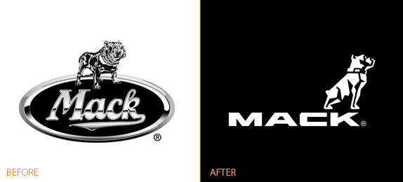
Mack Trucks announced a new branding strategy and an updated logo at the ConExpo/ConAgg construction convention in Las Vegas. The logo, which Mack says is a key element to its rebranding efforts, has a sleeker, more modern look with the Mack bulldog above the word Mack.
A Mack Trucks spokesperson says the rebranding “sends a strong message about the” changes its making, particularly in the company’s research and development in the last several years that have led to products like the Mack mDrive automated manual transmission, the mRide spring suspension and the Mack GuardDog Connect.
“We believe the refresh of our brand embodies what we’ve stood for in the past and continue to stand for today. We’re confident and passionate about our trucks and our customers,” said Stephen Roy, Mack’s president of sales and marketing. “We have a great history, great momentum and the conviction that our best days are ahead of us. The brand work we’re rolling out here in Las Vegas clearly communicates the strong position Mack holds today.”
Major League Soccer (MLS) Rebranding
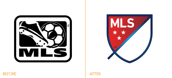
This year Major League Soccer replaced its traditional cartoon cleat and ball logo with a minimalist version. The new logo is part of a larger rebranding set for 2015 as MLS heads into their 20th season.
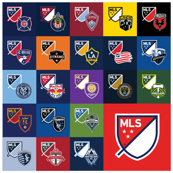
In addition to the official red, white, and blue logo, MLS also revealed team-specific versions for each club’s colors. Teams will retain their current logos on the front of their uniforms and the league badge will be on the uniform sleeve.
Morton Salt Rebranding
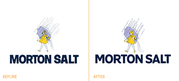
This year Morton Salt launched a year-long campaign in honor of the Morton Salt Girl, who marks her 100th year as the face of the brand in 2014.
Morton Salt is also refreshed its brand this year by updating its logo and introducing a new packaging design system.
Nescafe Rebranding
This summer the Nescafé coffee brand launched a new identity in an effort to appeal to a younger generation of coffee drinkers. For the first time in its 75-year history, Nescafé products will share the same visual identity and the new slogan, “It all starts with a Nescafé“.
Olive Garden Rebranding
This year Darden Restaurants, Olive Garden’s parent company announced many new changes for the struggling restaurant chain including a new logo, new menu items, and interior renovations.
But with the release of this new logo, it appears that there are more questions than answers.
Olive Garden’s parent company Darden, owner of other generic dining chains such as LongHorn Steakhouse and Red Lobster, shows great excitement in Olive Garden’s new logo as part of its rebranding efforts. A minimalist, bespoke design, the new logo has been turning heads and generating at best mixed reviews.
Learn more about the Olive Garden rebranding.
PayPal Rebranding
For 15 years, PayPal has been making transaction processing safer, easier, and more user-friendly. However, for years their logo has been judged as anything from bland to “relative of a parking sign.” Therefore, the company unleashed a new logo in 2014 the first time in 7 years, symbolizing forwardness, innovation, and vision.
The refreshed branding features four key elements:
- a new wordmark in a new typeface (Futura)
- a new version of the double-P monogram
- a refreshed color palette
- a new ‘dynamic angle graphic’
“Our new brand identity goes far beyond an updated logo,” said David Marcus, PayPal’s president. “We have aligned this with our first global brand campaign. We’re setting a new expectation with our global consumers, developers and merchants: PayPal is redefining the future of money by putting people first. After all, money doesn’t make the world go round, people do.”
Learn more about the PayPal rebranding.
Pizza Hut Rebranding
In November 2014, Pizza Hut launched their “Flavor of Now” rebranding campaign which included a new logo (their fourth in just 15 years), packaging, updates to their website, and big changes to their menu.
- 11 new pizzas
- 10 new crust flavors (ex: salted pretzel, honey sriracha)
- 6 sauce choices (ex: buffalo, garlic parmesan)
- 5 “premium toppings” (ex: Peruvian cherry peppers)
- 5 “drizzles”(ex: balsamic, buffalo)
- Skinny slices (250 calories or less per slice)
Reebok Rebranding
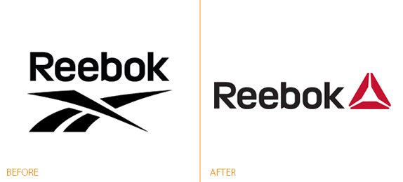
Early in 2014, Reebok changed their logo in a rebranding effort to match their new brand focus: fitness. The new Reebok Delta Symbol is intended to represent “the positive and transformative change that fitness can have on a person’s life”.
This marks only the second major logo change in Reebok’s 121-year history. You can read the full release here.
Southwest Airlines Rebranding
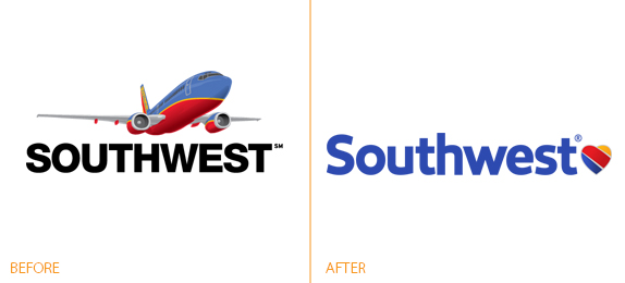
Not to be outdone by competitors’ rebrands, Southwest Airlines, the airline giant that continues to grow, announced a rebrand of its own this year; putting its heart on its sleeve and displaying its commitment to employees.
The airline proudly unveiled a new aircraft livery, named Heart, airport experience, and logo. The new look puts the airline’s Heart on display, showcasing the strength of the nearly 46,000 Employees Companywide–whose dedication can be felt by every Customer each time Southwest Airlines connects them to what’s important in their life.
Southwest’s rebrand is by far the airline’s biggest to date. Southwest has tinkered with various branding elements over time, but this push is different in that it covers all communications, products and even its airport kiosks. Southwest revamped its planes exteriors in 2001, but the company continued to use the same logo and marketing. In recent years, it’s cycled through a number of campaigns and taglines, but kept the same look on its aircraft.
VISA Rebranding
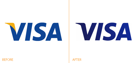
Early in 2014, VISA introduced a new tagline and logo. The tagline, “Life Takes Visa” is their first new tagline in 20 years.
Is your company considering rebranding? View the following resources:
2 Comments
Pingbacks
-
[…] Want to see more rebrands? We took a look back at big rebrands in 2014. […]
-
[…] a branding agency, we like to be on the lookout for the latest logo and brand redesigns, like the rebrands of last year. But this time, Logo Design Services created the Infographic below, showing the most recent revised […]

