Your company’s logo is the single most visible visual and recognizable representation of your company. It is the face of your company and should be simple, visually convey meaning, and be distinctive from competitors. Strong logos are iconic and remembered forever. But what if your logo is being remembered for all the wrong reasons?
Drive through, $5, and stock logo services are causing a terrible logo epidemic that often makes you wonder how many of these logos even got past the approval stage. We were going to order the logos below from bad to worst, but found that is difficult to choose exactly which one was the WORST. We will let you decide for yourself. Check out some of the worst logos found around the web below.
Arlington Pediatric Center
Apparently it took a lot of negative attention for the people at Arlington Pediatric Center to realize they may have made a mistake. Check out the logo they are currently using today below. We may still have our reservations about the new logo, but it is at least a step in the right direction.

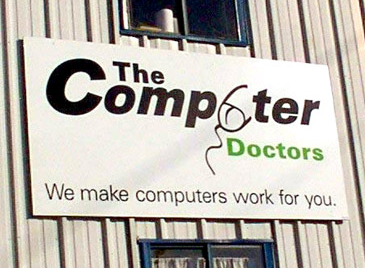
The Computer Doctors
Their logo is not working for them.
Catwear
Because nothing says ‘Independent Woman’ like a cat’s ass.

A-Style
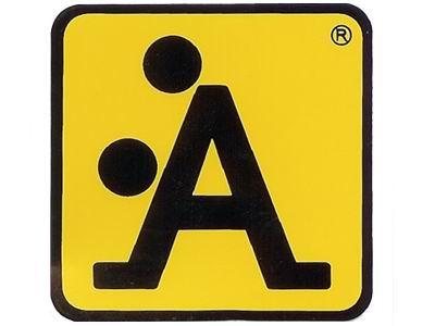
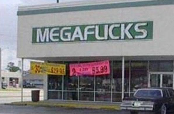
Megaflicks
Typography is another VERY important element to consider in overall logo design.
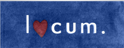
Locum
Maybe they should have stuck with the O…
Kids Exchange
Spacing is also important.

2012 Olympics Logo
Here is an example of a recent logo receiving criticism from the media.

Comprehensive Health Care
Welcome home! We have nothing to hide, or do we?
Junior Jazz Dance Class
Not exactly the dance class mom had in mind.

The examples above reinforce the importance of great logo design (and common sense). Thanks to Business Insider, Bored Panda, and 1st Web Designer for ideas/photos. We’re sure there are a lot more examples out there. Do you have any to add to the list? Please share them in the comment box below!


